Tuesday, April 28, 2015

PSU Studio Critique: Crit 4

In critique 3, with Emi Gennis and Rhona McBain, I presented several sections of fabric in color, which is new for me! Overall, the conversation between the three of us was focused on my career, beyond college. The most important thing for me to do is to create, and the logical way of doing so initially means having a job, hopefully in a creative area, and having a studio space to produce work. They have greatly encouraged me to continue to keep my ideas big and broad, the less limits I give myself, the more possibilities there are. Rhona also suggested alternative processes such as cyanotype. 
These images are a few of what I presented to them last time. 1. Layering of color, 2. My screen print on fabric, & 3. Four sections of the same patterns in different colors to see the qualities each color lends best. Side note about screen printing, I will be meeting with Chris Huitt in GIT to get some tips on screen printing as he teaches the course over in the Tech Center. 

As for critique 4, I will be bringing the elements from the previous 3 critiques and some work that I have been creating recently. I have been inspired by artists who have taken stumps of trees, sanding them down, and creating a relief print of it. I have two stumps in my yard so I decided to give it a try. My attempt was not nearly as successful as those who have spent quality time sanding the surface, as I printed my stumps as is. I would love to find a perfect stump to sand down and print on fabric to make pillows or a tote bag with.

This site shows and example of this type of printing. http://www.ashesandmilk.com/blog/paper/bryan-nash-gill/

Here is my attempt at this... Again, not as successful as it could have been. I was also able to get a few prints with my usual technique of picking the image up with my brayer. 

Lastly, from this trial, I discovered a different way of picking up the image of an object rather than running the ink-coated brayer over the object. Instead, I ran the brayer across the paper with the object under the paper. Here is a comparison image of the two techniques with a fern.

-------------------------------------------------------------------------------------------------------------------------
As for the artist post section, I would like to introduce you to ceramicist, Sylvia Schultze. She has been on a journey to capture feminine body parts within fruit and sculpting them with clay. These beautiful sculptures are functional pieces of pottery that challenge the user in how they want to approach the vessel. I love the whimsical approach she has taken not only with creating these pieces but the overall idea. She wants to create something that will be lighthearted for her audience and certainly eye catching and conversation starters. Keep up with her blog as she is constantly producing more pieces to this collection of works. http://sschultze3.wix.com/sylviaschultze

Tuesday, April 7, 2015

PSU Studio Critique: Crit 3

Last critique, with Portico Bowman, I presented my first screen prints and new textile work with my "transition" into color. My first step was to use white ink on black fabric, rather than the reverse that I have primarily focused on. A funny way of starting this transition; however, the results were shocking! Portico mentioned that all of my textile work, but this white ink on black was even more evident of looking X-ray like. This presents all of the essentials within the image. She also stated that my work is "ugly," as in viewers are responding to a person behind that work who is investigating and searching. The audience is responding to that person as it gives them a safe zone to view the investigation. The work isn't focusing on perfection and taking the artists hand out of the work; it's the very opposite and apparently very relatable and tantalizing. Quite a compliment to my work. 
For this third critique, I will be displaying my further investigation of different colors within my textile printing. The purpose of this is for me to have an understanding of which color lends its best qualities as well as where it lacks. Having this inventory will help the future of my printing. 
As for my shadowbox series, as time dedicated to my studies is extensive, the series will not be completed by the end of the semester. I will gradually be developing the elements for the seven shadow boxes. This is not a project that I want to rush, which is why I have decided to focus on several crucial elements of the series this semester. 
The following two images are the first two screen prints that I have ever done (I brought to the 2nd critique). Definitely new to the process, but now I have a little experience under my belt!
This third image is of the third screen that I made (again had difficulty with the emulsion, but learning!). I will bring a print of it to this next critique. 
 Here are the colors of textiles that I will be bringing to the critique.
This is a little preview of the new natural objects used in my textiles for this next critique. I have never used most of the items before, especially lichen. 
------------------------------------------------------------------------------------------------------------- 
As for a fellow artist, I would love to introduce you to Rudi Rodebush. Her sense of humor is evident through conversation and her work. Last year she worked on a book of hand-cut paper images that correlated with a quote. With raving reviews from her peers, she was hesitant about sharing this book as it was almost like sharing a diary as the stories portrayed were personal and more negative. This semester she wanted to continue with her passion for cut paper but with a happier, positive direction. She has been creating comical pieces that capture her humor and general positive attitude that she carries. Check out her blog to see what I mean! She has a real gift and I wish her the best in her artistic career!
http://rudirodebushart.blogspot.com

Thursday, April 2, 2015

PSU Studio Critique: Artist Lecture

Teresa Harris is currently a featured artist in Pittsburg State University's Museum of Art in the Harry Krug Gallery in Porter Hall. Her lecture was on January 23rd in which she spoke about how art was introduced into her life and her processes. I found that there are many parallels in our lives and interests in the arts, it was a very rewarding lecture to listen to and individual to meet. She was very professional in how she presented her work and herself as an artist and was a very sincere person to talk with. 


The following is her artist statement: 
Symbolism saturates my work. I am moved and influenced by what has come before me: the symbol-laden art of the Middle Ages, the purposeful and impeccable craftsmanship of ancient handmade books, and my own rich familial history. These connections to the past guide the iconography of my work. I deliberately choose to use objects over imagery, symbolism over realism, and suggestion over definition.

Teresa has been sharing her work in exhibitions since 1982, since 2009 she has been in over 40 national shows, commissioned work AT&T, and even part of a selected corporation collection at Saks Fifth Avenue in New York City. She is currently a working artist and associate professor of art at Missouri Western in St. Joseph, Missouri where she teaches typography and graphic design. 


She grew up on a farm with her many siblings and parents where problem solving and improvising was a must. These skills have artistically been useful throughout her career. She loves art history and has been inspired by Jim Dine, Jasper Johns, Joseph Cornell, and Timothy Barrett. She obtained her undergrad in studio art where she focused on all media but was especially interested in paper art her senior year. This was a very new time for paper art and she ended up making it to print on. 


Her first works were of course paper but much more sculptural. They were very fine and perfected papers then after a few years she began to create more narrative pieces and boxy shapes. She researched and created many types of Japanese paper. In graduate school, she began using new materials such as metal which gave dimension to her work. Beeswax was another addition to her work as well as writing stories that were incorporated into the work. 


The Storytellers series in the PSU gallery, she mentioned that there are three common themes that connect every piece. 1. Language: text, print, written. 2. Containers: book, envelopes, house form with window-to contain story. 3. Portraits: autobiography of family and pure fiction from found images. With all three of these elements evident in her work, you are able to get a sense of a story she is telling. She even has bit of letterpress pieces such as leading and furniture. 


Her work is inspiring to me as I too have great interests in letterpress, printmaking, paper arts, mixed media, containers/boxes, and telling stories of my own. I also have a big family that grew up on a large plot of land in the country. Seeing her success and joy for her artistry is a breath of fresh air as I am embarking on my own journey along a similar path in media. I feel that I will refer to her work often in my own career. Another connecting point is that my dad, a former potter actually knew Teresa and her husband in the early 1970's. I even own, and use very often, a piece of his from 1974!

If you are interested in learning more about Teresa, here is the about page for her on the Missouri Western website and her personal website.
https://www.missouriwestern.edu/art/about-us/faculty/teresa-harris/ 
http://teresajharris.com

Tuesday, March 10, 2015

PSU Studio Critique: Crit 2

CRITIQUE -
The first critique with Josie Mai went really well. I got a lot of positive feedback on my concept. She made a suggestion that I should hang the series on a calm horizontal line, any other way would distract from the pieces. She asked about when I envision completing this series. Originally my response was to complete it by the end of the semester; as this series has become quite complex, it is very important that I don't rush through it. I also feel that through working on this project, I will be coming up with a lot of other projects as I am incorporating a large variety of techniques.

As my group did not meet with Jamie Oliver during the critique, I met with him one-on-one for his input. He responded well and with a lot of great things to consider. He recommended researching other shadow box artists such as Joseph Cornell. With Cornell in mind, he brought up how I could go about adding the items within the shadow boxes. Cornell compartmentalized them and had things in boxes and other enclosures, as I have used containers in previous work, this could be incorporated nicely into my series.
Jamie also mentioned altering the natural forms used in my works; for example writing or printing onto them, like drawing on bark. He even suggested (with very little pressure to not break it) using glass through a letterpress as that would extend the "traditional" usage of a letterpress.

As for what I have accomplished since the last critique, I recently met with Portico and explained my project to her. A huge take away from that conversation was how to approach words within the piece as traditional letterpress printing is completed with type. Her take on words in art is that they need a very specific purpose and should not tell the story; they need to be visually appealing as well as create questions from the viewer as any other element in a work of art. I have chosen to use one word only in each of the seven pieces in the series, that word will be descriptive in regards to that work within the entire story of the series. The words I have chosen are from words my siblings used to describe the different parts of the series. Those words are: bittersweet, camaraderie, yearning, savior, enclosure, transition, and assimilation.

I have also decided on the exact dimensions of the 5 shadow boxes and the two mounted pieces. They will all be different except the two mounted ones. I have created my screens for the screen printing element of the series and have begun developing the textile elements. As I am very new to using color in prints, I warmed up with with black as I am comfortable with it and then transitioned into using white on black fabric. This was really exciting and created very dramatic imagery. The plan is to continue to work with one primary color at a time to get an idea of what color works best for what before combining layers of different colors.

ARTIST POST -
I would like to introduce a fellow artist Mattie Parrigon! She is currently visiting nursing homes to listen to the stories of the residents. Through those stories she has been creating a series of drawings with a quote from the person she has interviewed. The simplistic pencil images are quite touching and work very well as a cohesive story. I am extremely excited to learn about the other residents that she has been conversing with. I feel that this project is so meaningful and so kind to give elders a chance to share stories of their lives with someone. Check out her blog to learn more about what she is up to... http://mattieparrigon.blogspot.com/Â

Wednesday, February 18, 2015

PSU Studio Critique: Crit 1

1st CRITIQUE:
Through the past few weeks I have been contemplating a series that would include letterpress and textiles. Generally, I have seen these processes in a commercial setting, however, I am wanting to display them in this series in a "fine art" manner. Through brainstorming I have decided that this series will include 7 pieces that range from letterpress to textiles, with them gradually meeting in the middle with "hybrid" works. The first and last pieces will be mounted and as the works grow to the middle piece they will gradually become deeper shadow boxes.

The inspiration and theme is based upon the word "hiraeth," which means "a homesickness for a home to which you cannot return, a home which maybe never was; the nostalgia, the yearning, the grief for the lost places of your past." As I am currently going through a prolonged transition with many changes in my family, this series is my way of addressing the events happening. The word hiraeth parallels many aspects of this transition. Each work will have this common theme but each will have a more specific purpose/focus: parents, siblings, myself, land, house, and the word hiraeth.

As I typically use organic objects, textures, and various papers in my work, I will be incorporating those within the shadowboxes to tell my story. This series is as much about the subject as it is my processes and materials.

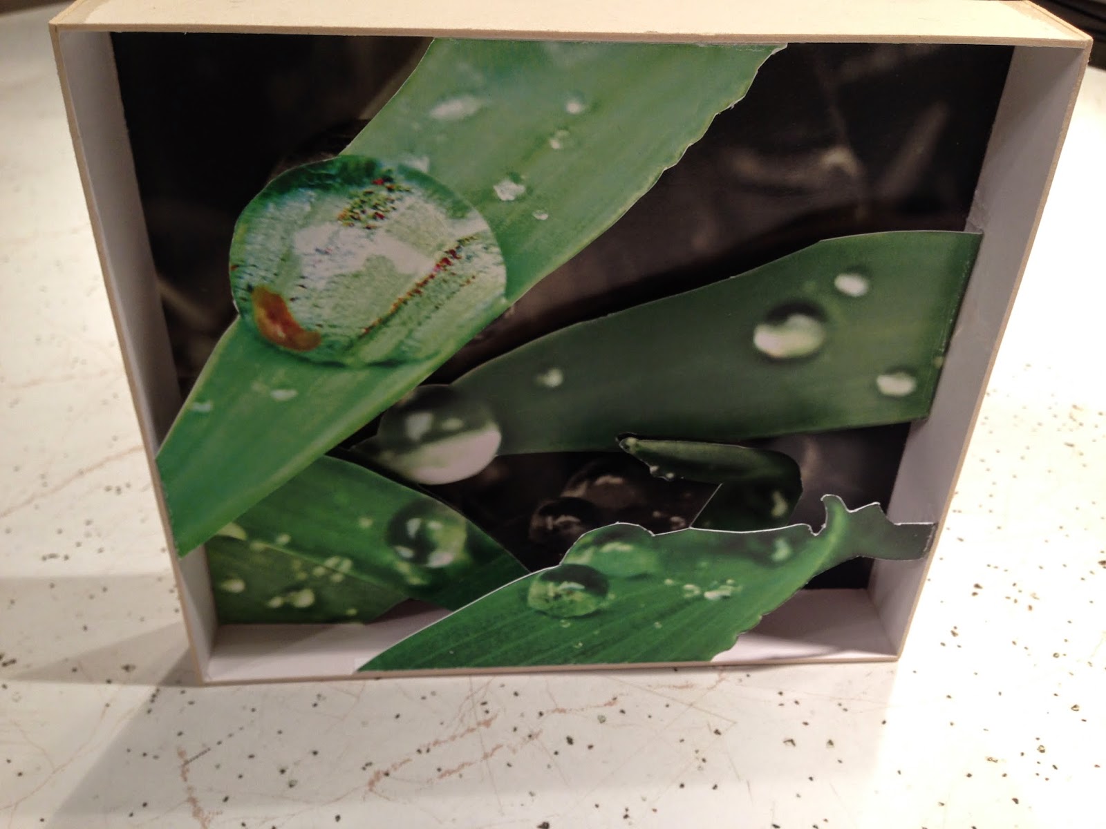
The following three images are in reference to the shadowboxes. The first two are past works, each of which were playing with various materials and values to create visually interesting 3D compositions. I received a lot of encouragement to further my shadowboxes, which is where the third image comes in. They are the two medium depth boxes, there will be two shallow ones, and one very deep box. All of which will be various heights and lengths and filled with many layers of prints, images, objects, etc.

These next two images are examples of my recent letterpress work (on the left) and textiles (on the right).


I received a mailer from this school and was intrigued by the leaves, which ended up being run through a letterpress. I would like to incorporate this approach with the letterpress and my organic found objects that will be placed into the shadowboxes. 

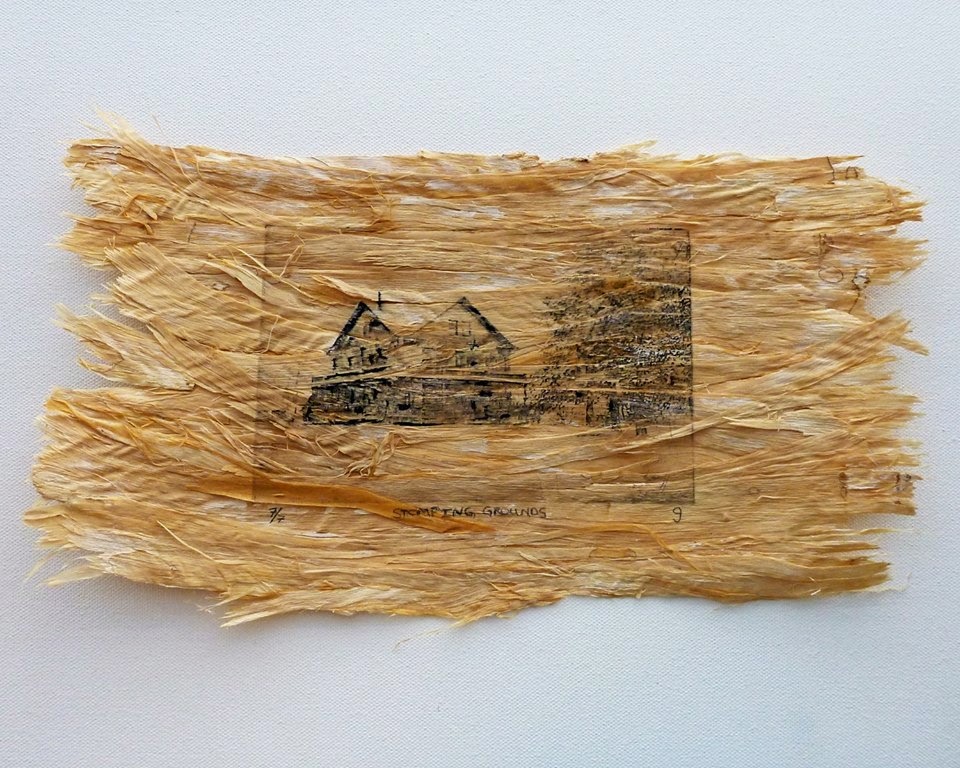
This is Stomping Grounds 7/7 which I created in 2013. My series will include more of that tree bast which was harvested from my family's land and the image of the home. This upcoming series is an extension of this piece and The Lifecycle of the Book.

I just received new fabric ink colors and a few items that I will use to learn how to screen print. I hope to incorporate this new skill into the textile portion of the series.

I have tracings of bark over textile prints of leaves and an image of found objects from my family's land. I will literally be using the found objects as well as incorporating them as tracings, images, drawings, prints, textures, transparencies, etc.
I have put a lot of thought into the concept of this project, more so than I have ever done. That being said, I am currently in the stage of gathering materials, building the shadowboxes, and formulating a plan of action.

ARTIST POST:
I now would like to talk about my classmate Molly McVey. She is minoring in photography as she works on her bachelors in 2D fine art. Most of the work that I have seen of hers has been equine photography, however, her main focus is about sharing relationships that she captures in a photograph. Through the past year she has been combining images of texture with a form, usually an animal, to create a unique alteration to the form. I look forward to seeing the work that she produces this semester and what texture/animal connections she makes.

She has expressed that she is inspired by Erik Johansson who has his own method of combining photos into imaginative scenes. I can see why she looks to Johansson's work for inspiration, it really is eye-catching and thought provoking. http://erikjohanssonphoto.com


You can learn more about Molly McVey at her blog:
http://mollymcvey.weebly.com/studio-critique-15sp-art-350-01

ID SERIES: 
I was at the Interdisciplinary Lecture Series: Art as Healing from 1-4:30 in our brand new performing arts center. It was a thrill that this was my first experience in the Bicknell Center. I was able to listen to: Dr. Harriet Bachner, Melinda Ledlow, Jessica Stallings, Dr. Gaelynn Wolf Bordonaro, Dr. Janice Jewett, Josie Mai, and Maria Lupo. I was most interested in the first lecture by Bachner and Ledlow as they spoke about trauma. Their lecture explained what trauma is, how it happens, what it does to the body, and gave hope to get past it. With my own traumas and triggers that create psychological issues, I was able to learn more about what I am dealing with. It was very unexpected but I am grateful that I was able to attend. Bordonaro and Stallings spoke about the many types of art therapies, most of which I was not aware of. Jewett had several individuals from the audience (including myself) do a "dance" task to show how physical movement is beneficial to mental health and also lectured about dance. Mai spoke of her involvement with Joplin's art community after the tornado. I was unaware of her incredible efforts as well as just how powerfully art brought the community together after the horrific event. Lastly, Maria Lupo our visiting artist, gave her lecture about her art work. I personally do not connect with her work, however I admire her passion as well as her concise and professional way of responding to questions from the audience.

Thursday, January 29, 2015

PSU Studio Critique: Writing 1

Artist Statement: 

Exploration, as defined by the Oxford Dictionary, is “the action of traveling in or through an unfamiliar area in order to learn about it.” This literal sense of traveling into unfamiliar areas produced a sense of wonder and desire to explore the many unfamiliar areas that life has to offer. My love for nature brings me to exploring the vast depths of what could be. These organic objects and aesthetics are expressed through the lines presented within every media I have created with. It is important for a human to connect with oneself and with nature, peace in the soul and fire in the belly are found when doing so.

Existing is an exploration. This journey presented through an art form leads to investigating infinite questions. Creating is my chosen method of learning.


I am Catherine (Cat) Jepson, a senior at Pittsburg State University majoring in 3D fine art and minoring in graphic design. Growing up, I traveled around the U.S. selling my father's functional pottery at art shows. Through helping in the production, sales, and marketing, I gained knowledge and great respect for not only my father but other artists devoting their lives to an art career. All in all, art has been and will always be a huge part of my life; I always come back to it and it is always there for me. 

Initially my purpose for being a 3D major was not to necessarily focus on one medium but to broaden my skill-set. In the past year, I have found my niche and artistic voice. I would consider myself more of a multi/mixed-media artist and printmaker. Through independent studies courses and an internship, I was able to learn a lot about letterpress printing and in turn fall in love with it. I restored the art department letterpress last spring, had an internship at Skylab Letterpress in KC over the summer, and returned last fall to print on the press I restored. My other love was discovered this past fall through an independent study course over textiles (fabric printing and design). After finding these two printing processes, I realized that everything I have ever created or have been interested in has a design, texture, or aesthetic that would work well with either process. It gave a totally new meaning to my work, one that I have been searching for. As for my graphic design minor, the intent was and still is to understand how to be the designer as well as know how to appropriately and effectively work with a designer. I find this extremely relevant with the two printing paths.

My inspiration in generally from nature; however, there are a few artists that I look up to. They span from ones I have stumbled upon on the internet, artists that are discussed in classes, artists I have met or listened to through the lectures at PSU, artists I have grown up knowing from art shows, and of course my dad. I have several of their websites listed below. Liz, Paul, and David are artists that watched me grow up and are family to me. Along with my dad, they are all the most genuine people and through trade very hard workers. Their dedication to their profession is profound and nothing short of inspiring. Tara Donovan and Andy Goldsworthy are artists that were introduced to me through school. Both are very unique within their realms. Tara uses everyday mundane items and creates large scenes with said items that are breathtaking. Her use of material and how she transforms them into such an organic volume is incredible. Andy Goldsworthy’s use of nature as his canvas and medium of choice is truly amazing. He captures the essence of nature willingly, knowing that it may only last until the breeze blows it away. The Colossal website introduces the viewer to many artists and designers. The site is very stimulating and is a great resource. Bob Atkins is the owner of Skylab Letterpress where I was an intern at last summer. His perfection and pure love for his work is very rare and you feed off of that energy. Having skill is only a percentage of being an artist, having passion for what one does sets them apart. Lastly, Jeremy Collins is a KC artist and rock climber who has been able to merge the two and inspire the world. As I am an artist and rock climber, his story is touching and extremely motivating. He focuses primarily on maps of mountains, but has recently started a clothing line through Huckberry called "Meridian Line." Another recent adventure is his book and film called "Drawn" that he illustrated and told the story of his recent trips to the corners of the earth.


With graduation this December, it is evident that decisions are needing to be made about my future. Currently, I am planning to attend three relevant trade shows in NYC in May and am seeking an internship for the summer. After graduation, I plan to move west and work within letterpress printing or textiles. Then, on into the long term, I have a dream of having a space to work, where the goal is to bring out the creativity in people of all ages, as a healing method. Not only would this promote creative thinking but showing how inexpensive it can be, especially when reusing items. As for this semester, it will be critical to refine my portfolio and push my textile and letterpress work while preparing for my senior exhibition and job applications.

The following images are of my textile and letterpress work from last summer and semester. This will visually catch the reader up to where I am at and will proceed from this semester.


Wednesday, December 10, 2014

Presentation of Art Work: Post 3

In this post I will be explaining how I packaged my artwork for shipment. This project is a simulation of what it would be like to actually ship art to a gallery or to its new owner. In this case, I was to pay for and include return shipping in the package (which is standard for exhibitions). If I did everything correctly, I should expect it back in the mail within the next week.

1.) The first step is packaging this pendant. I have wrapped it in packing paper and placed it into this small black box which I have taped shut.


2.) This next step includes packaging this matted print. I have nested it into two plastic foam sleeves and then bubble-wrapped on top of that. The final image in this section shows that I taped the ends of the bubble wrap so that those edges are completely covered and the print is secure within all of the packaging.


3.) Now that these two pieces are individually packaged, it is time to place them in the box. I have added a base layer of packing to the box which, in this case, will not need to be removed by the person receiving the box. I have the matted piece laying flat and the jewelry box on its side next to the print. I have added a few pieces of cardboard between the box and the jewelry box for extra protection and plastic packing in the spaces on either side of the jewelry box to prevent any shifting.


4.) Now that the items are packed into the box securely, it is time to add the final bits of packing before closing the box and shipping. I have a few layers of plastic wrapping on top which will be cushion between the artwork and the top of the box. I also have a chunk of packing paper directly over the matted print as there is a bit of extra wiggle room which is not advisable. Any room for movement within the box promotes a much larger chance of the art work to be compromised during shipment.


5.) This last step is closing up the box at the post office. Before I taped up the box and handed it over to the postman, I placed an envelope on top. This enclosed a letter to the person receiving the box which listed contact information, a list of contents and where they are located in the box, and the return shipping label and postage. Once that was completed, I taped up the box, attached the address label and shipping labels, and off it went!

Now to wait for the package to return!